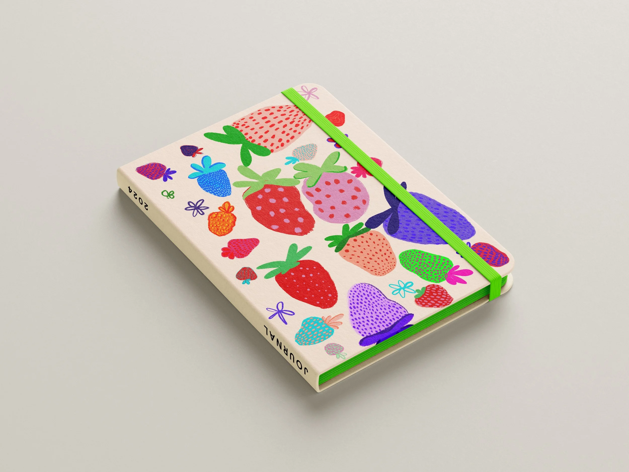
Dia & Co. is an online marketplace for plus size fashion. They offer over 10,000 plus and mid-size styles in one place.
As the sole designer at Dia & Co. I was responsible for creating compelling visual content across all marketing channels, worked on multiple campaigns, two business lines, and a myriad of customer journeys. I worked mainly in the digital space, creating assets for the website, email designs, landing pages, social assets and more.
A large part of my job was to partner with our Sr. Director of CRM and Retention Manager. We worked on taking deep dives into our email analytics to inform our strategy for retention & growth.
Role
Sr. Graphic Designer
Key Stakeholders
Co Founders
Company
Dia & Co.
Years
2023 - 2024
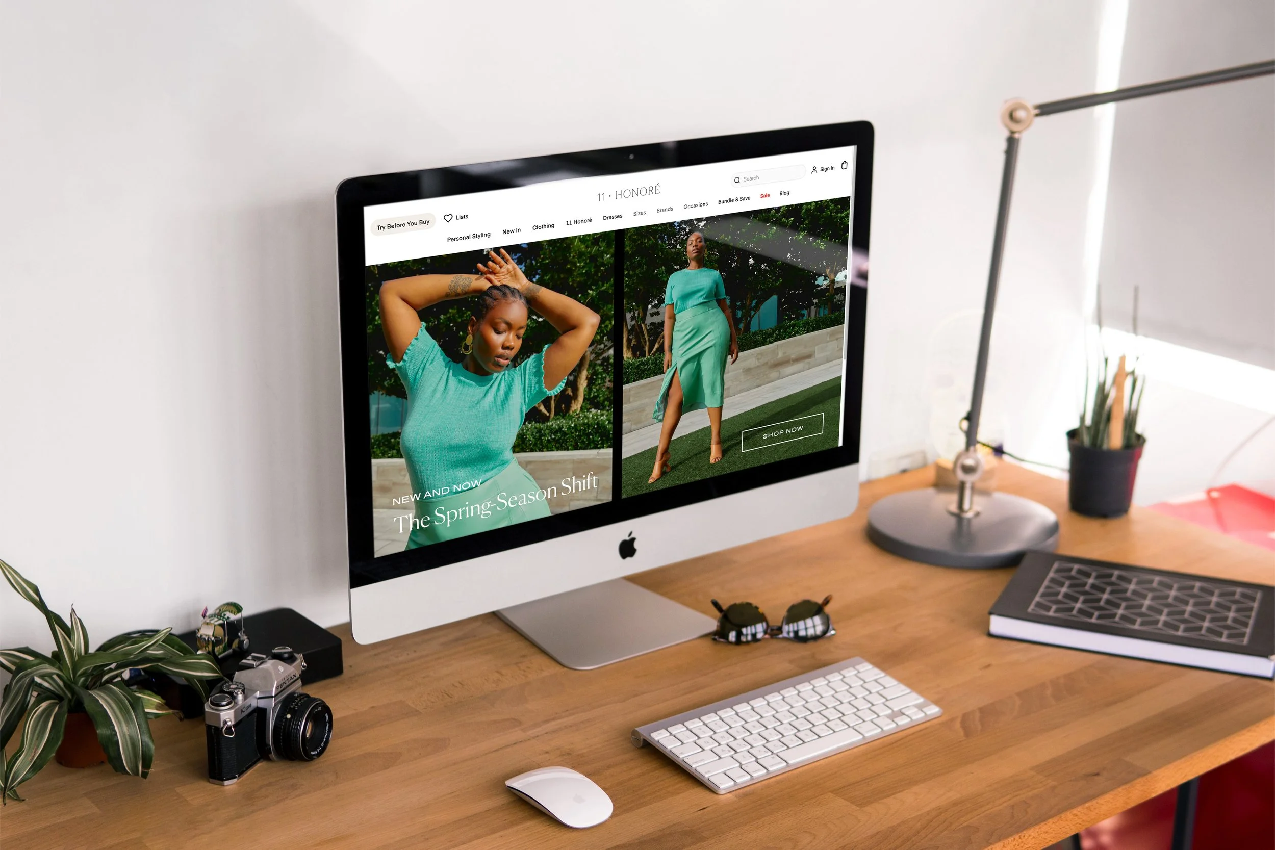
A landing page I created, for a Spring Edit with curated images and designed hero banner. This page drops customers into the merchandised Spring Collection.
Designed custom (CLP) landing page utilizing images from our campaign photoshoot. I created unique hero banners to drive home our slogan and highlight some quotes.
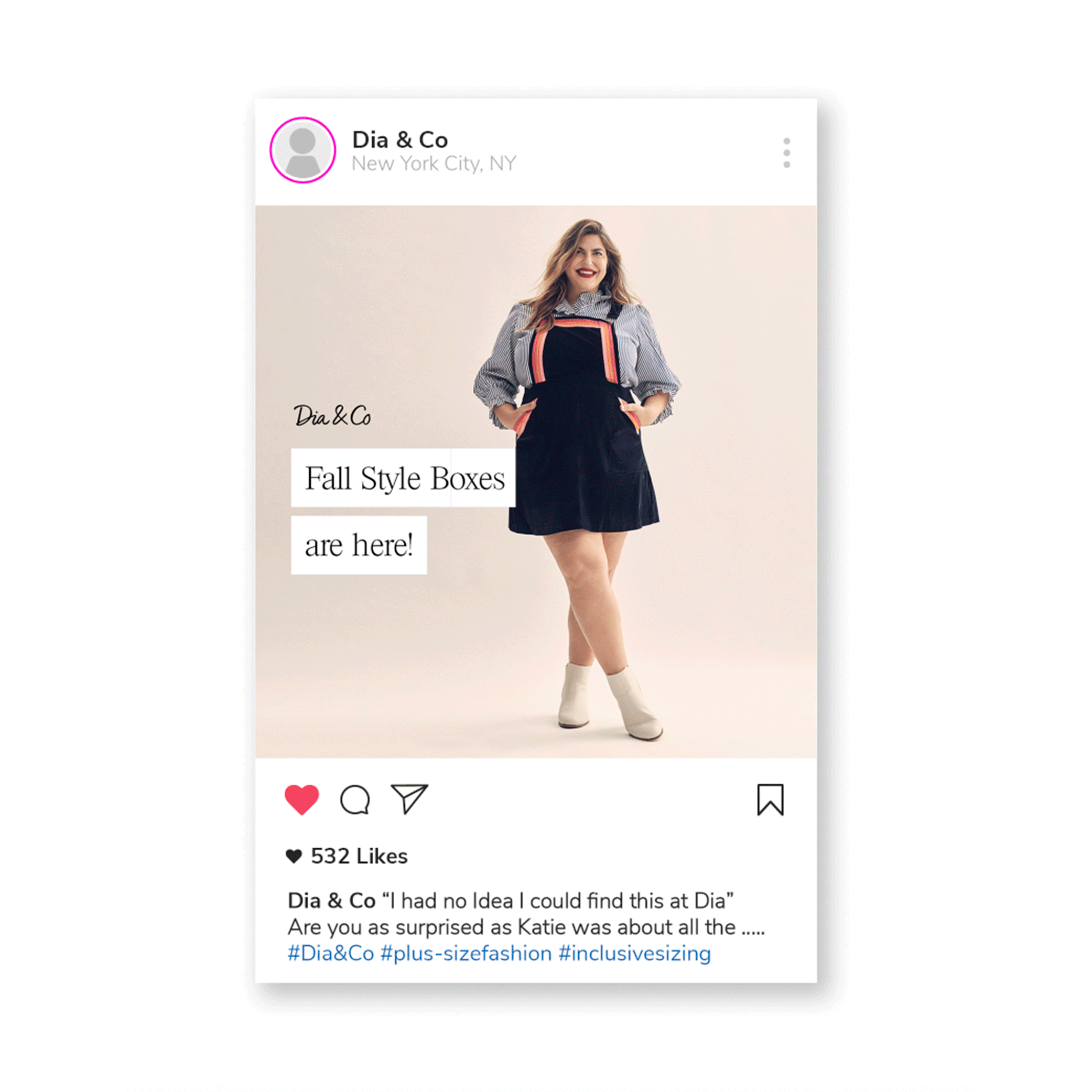
Paid ads I designed to launch during our Katie Sturino Campaign to drive traffic to site. These slides were created to support the the messaging around the arrival of the Fall style boxes, highlighting the option to 'try before you buy'. I used the white "tape" color block behind the copy in order to make the messaging feel bold and engaging. The beautiful photography was from the campaign shoot and tied back nicely to the rest of the campaign assets.
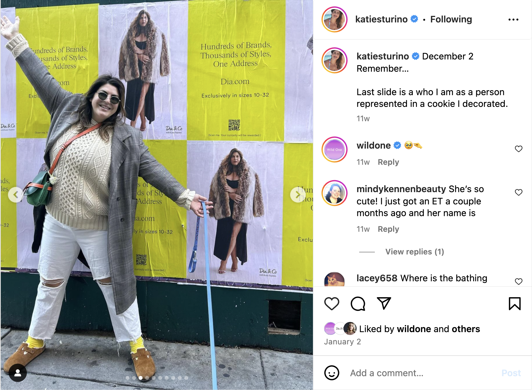
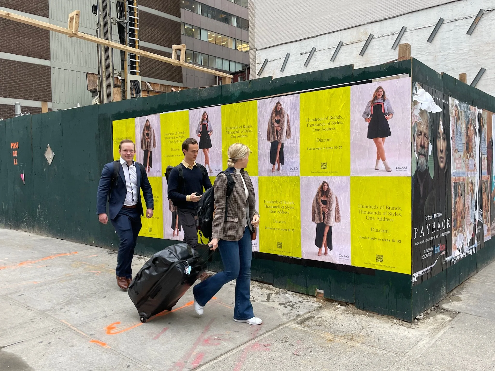
Printed OOH poster designs for our campaign with Katie Sturino spread throughout a few neighborhoods in New York City. The goal was to drive engagement by utilizing a QR code and inviting them to share a photo on social media to win a shopping spree. Additionally reinforcing the campaign tag line, "hundreds of styles, thousands of brands, One address...Dia.com."
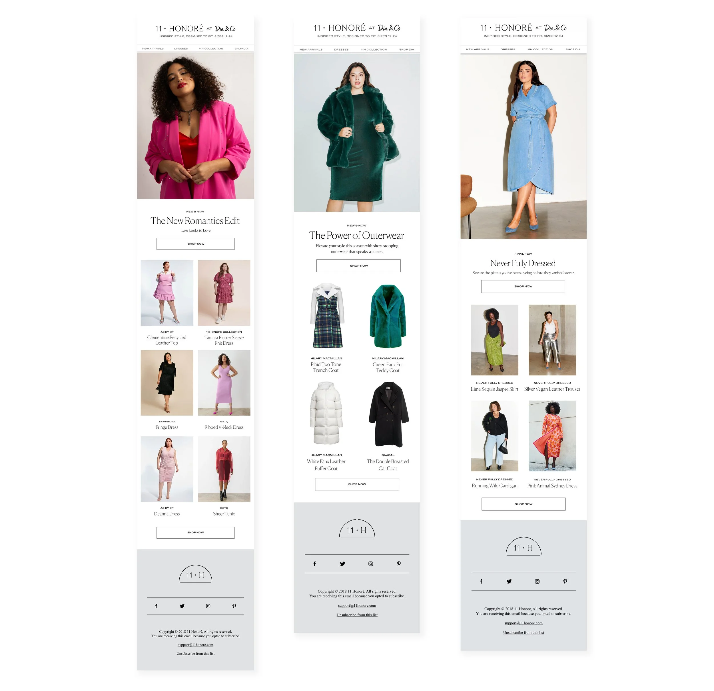
Select few emails designed for Dia & Co's luxury clothing line highlighting new collections or brand collaborations. I edited and curated the images as well as refined existing email templates.
A series of digital assets I created for our event collaboration with a size inclusive designer. The assets included a homepage refresh, with designed hero banners, curated images on site for a cohesive look, as well as social assets & emails.
FabFitFun is a lifestyle membership and shopping experience whose mission is to deliver happiness and wellbeing to everyone, everywhere. Its flagship product, the FabFitFun Box, delivers a curated collection of full-size products across beauty, fashion, fitness, wellness, home, and tech – each season.
In my role at FabFitFun, I work closely with the creative director + team lead on seasonal campaigns for their flagship product, a quarterly basis subscription box. I also worked across their digital social channels, website, email marketing and branding. I worked on various marketing materials and branding assets for some of the collaborations with influencers, celebrities etc.
Role
Sr. Graphic Designer
Key Stakeholders
Co Founders, Creative Director, Director of Social Media + Editorial,
Company
FabFitFun
Years
2022 - 2023
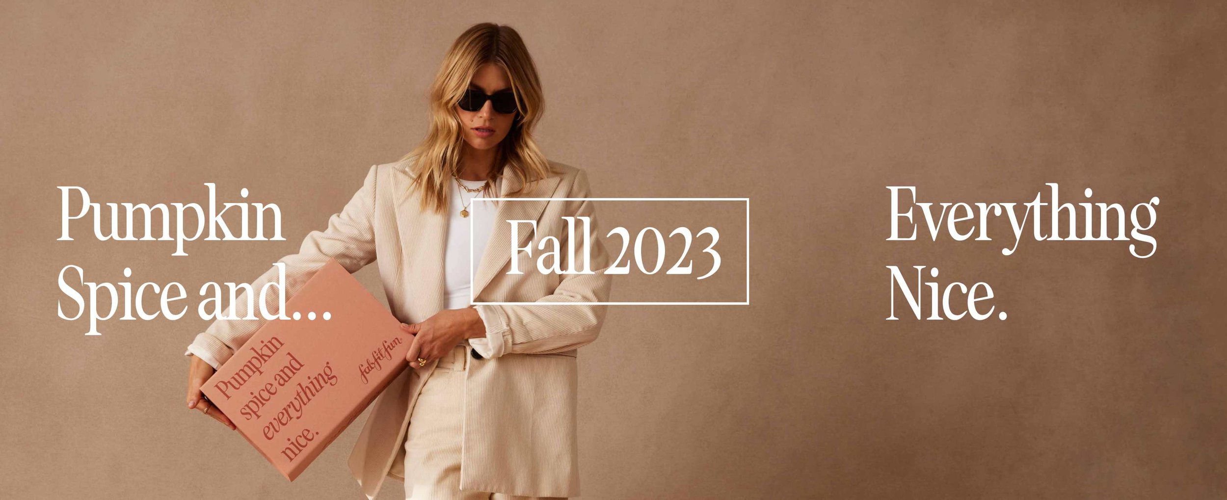
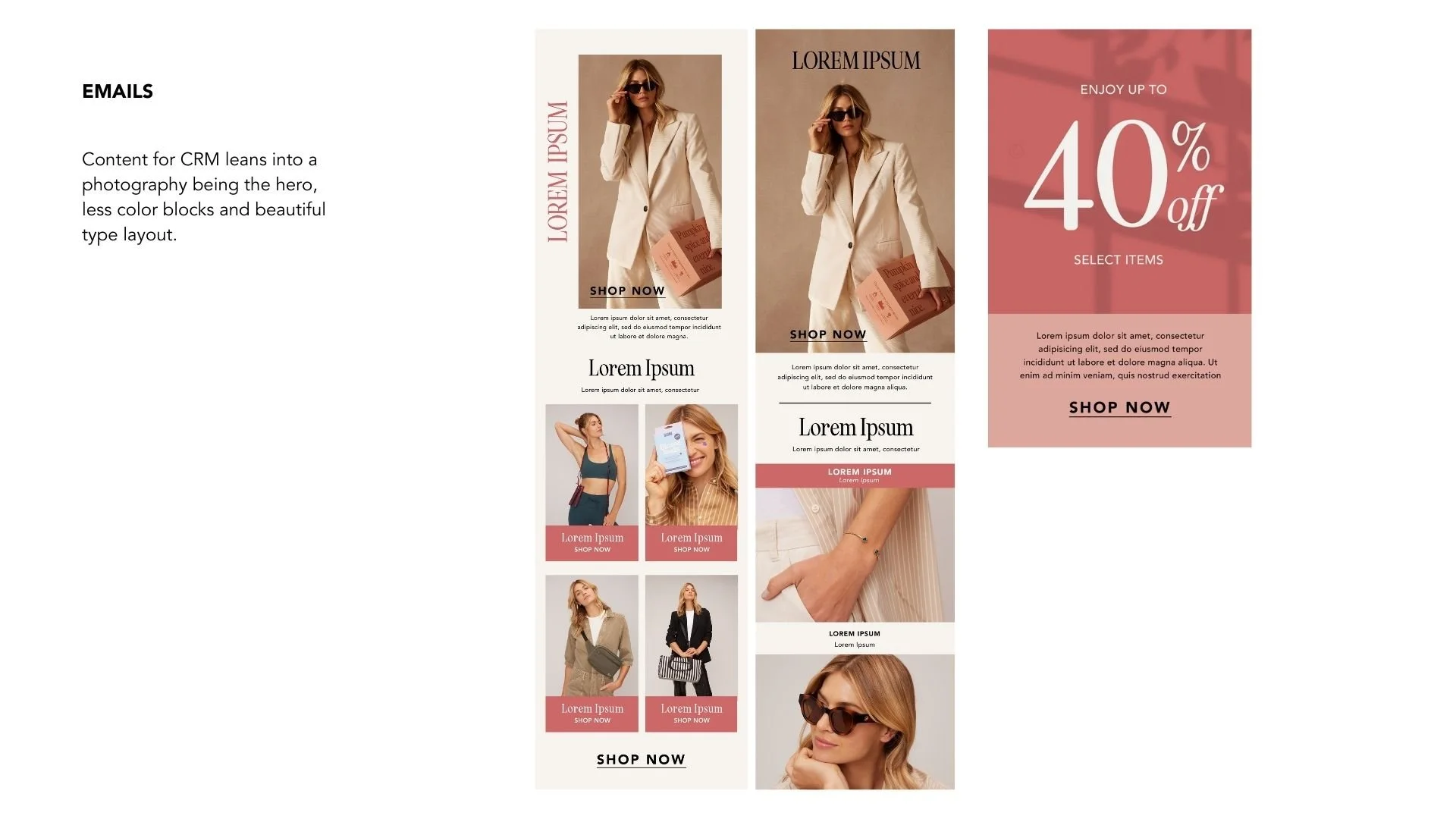
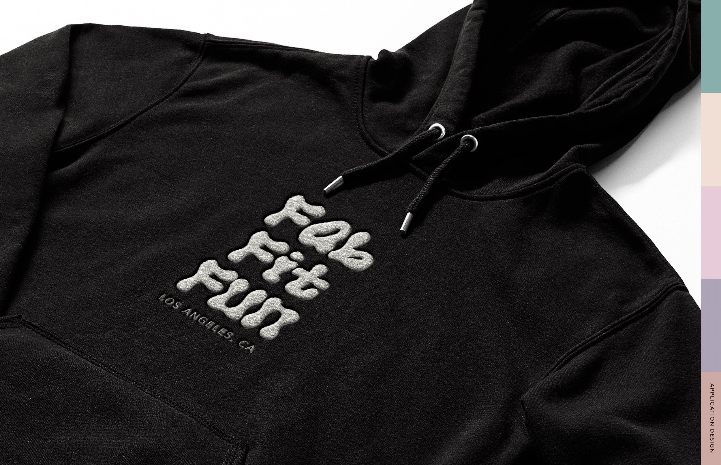
Fall 2023 Campaign with our ecosystem of assets. I worked alongside our team to create these assets. The emails specifically were a project I lead to create brand new designs that would be used as new templates, aligning with the rebrand. The goal was to create new layouts that would highlight the products and messaging in a new way, leading to higher clickthrough + open rates.
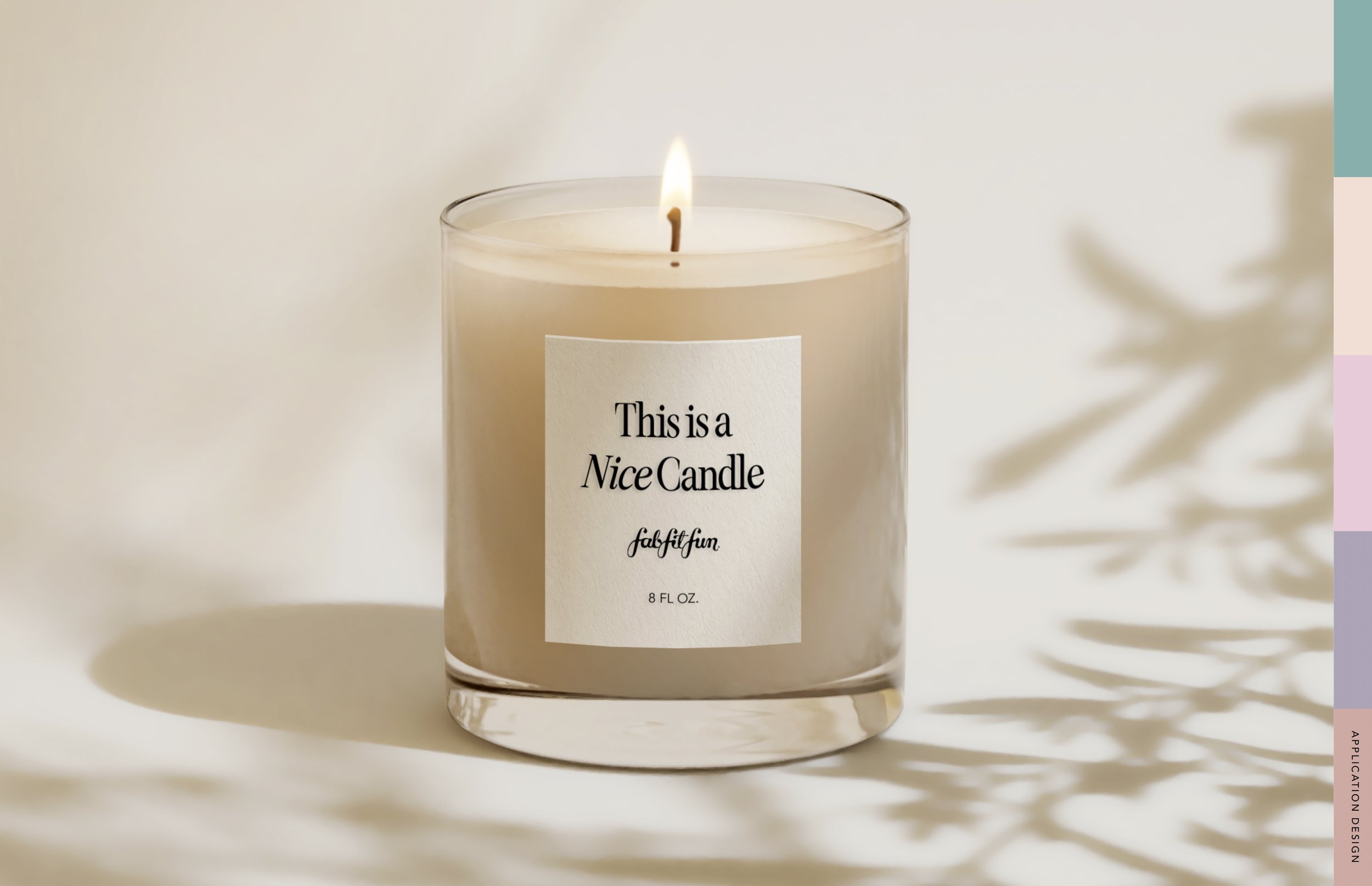
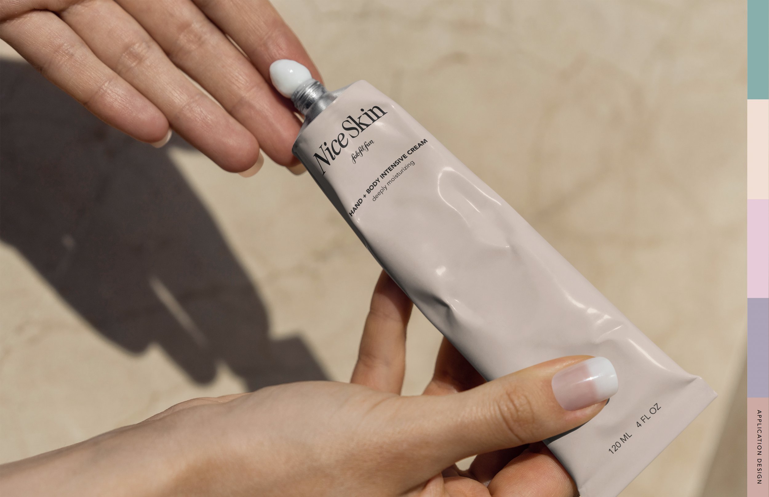
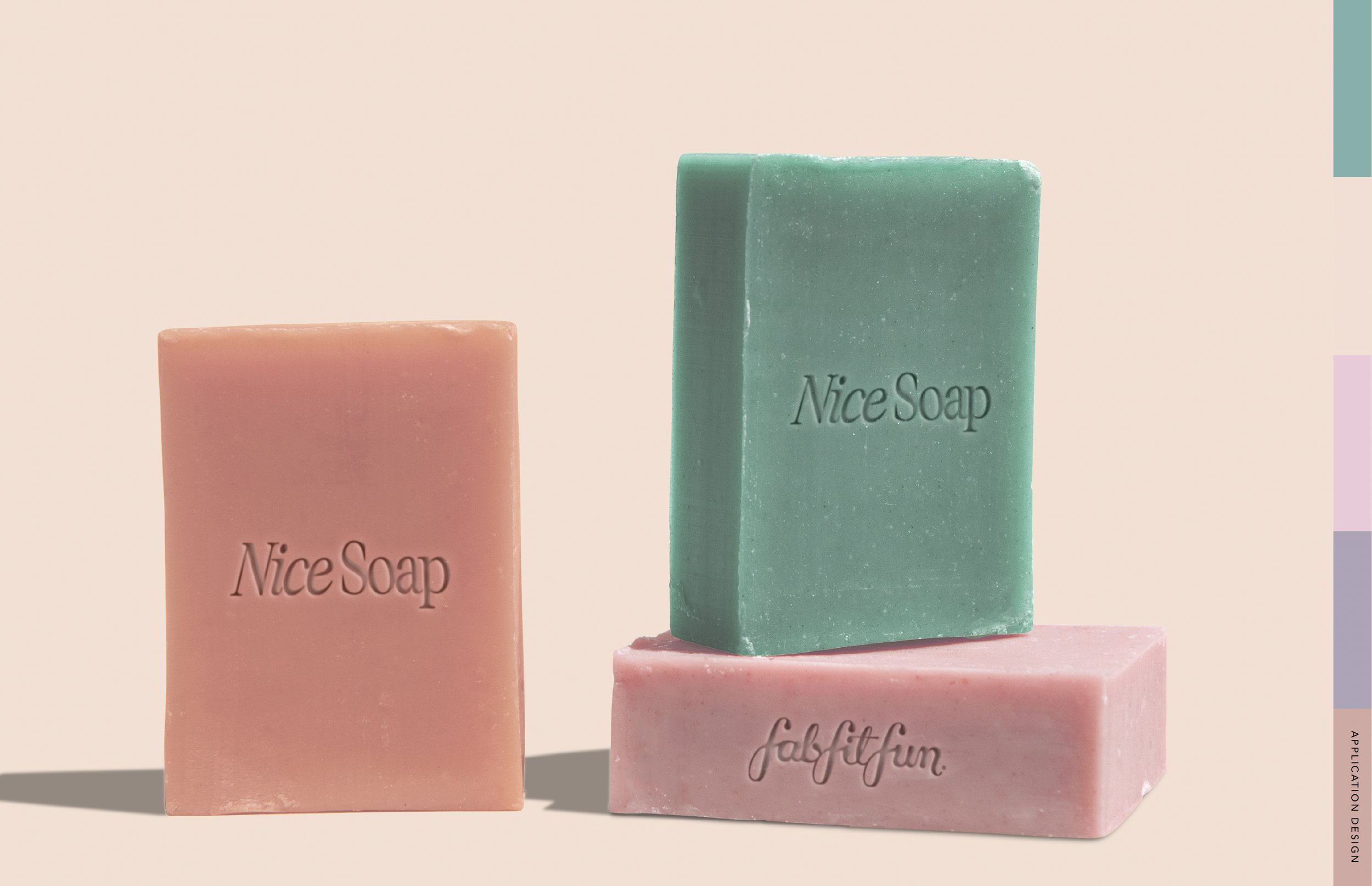
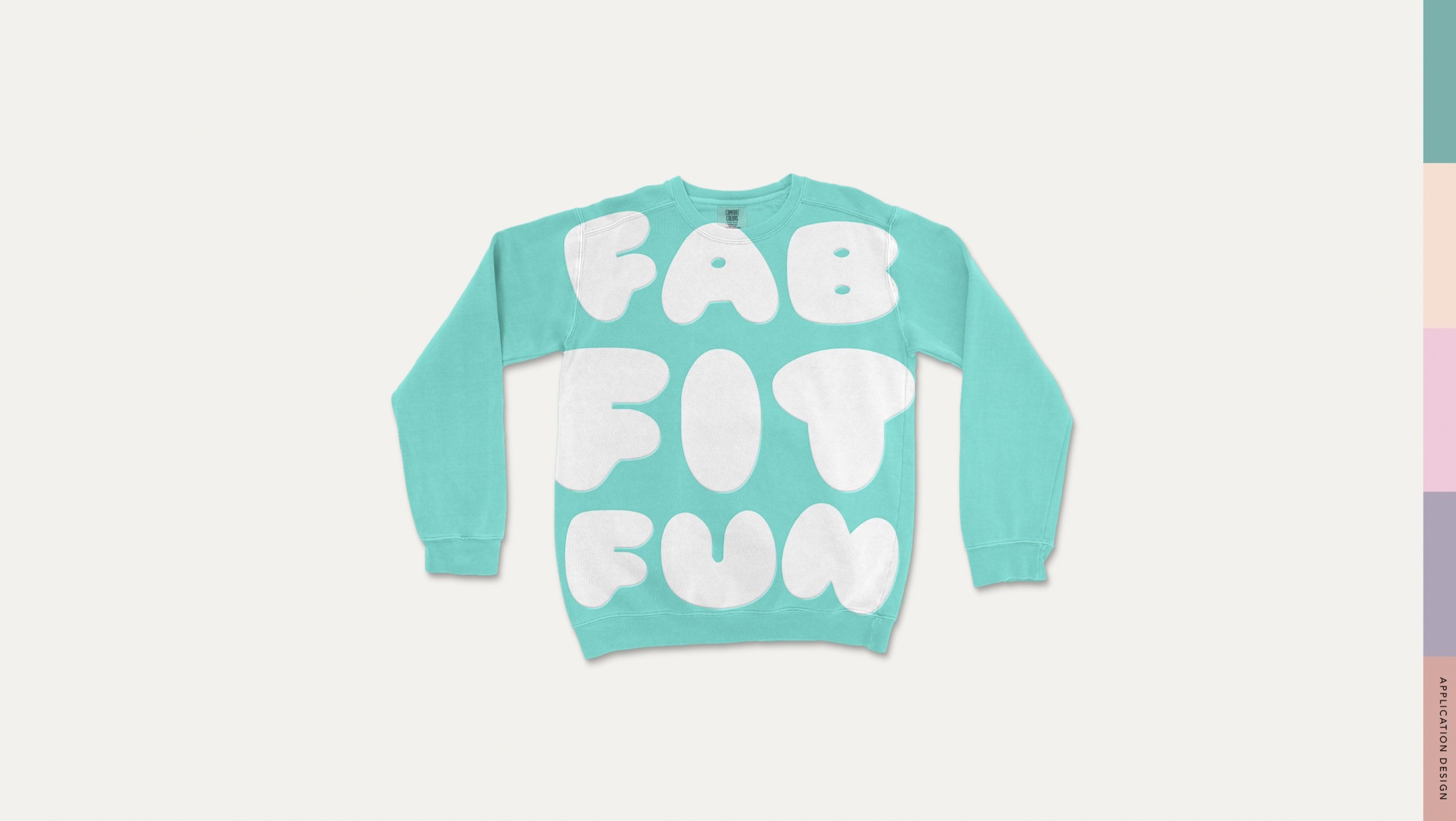
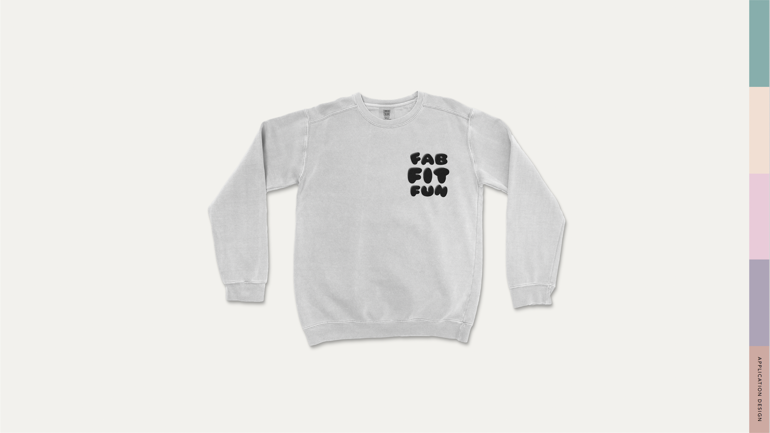
Conceptual designs I created to showcase how the new branding looks in application. The merch assets in particular were fun to create as I pushed the creative further out to achieve some fun new ways to use the FabFitFun logo.
Summer Intro social media assets I created for Instagram stories + feed.
This creative was prior to the re-brand that launched in 2023.
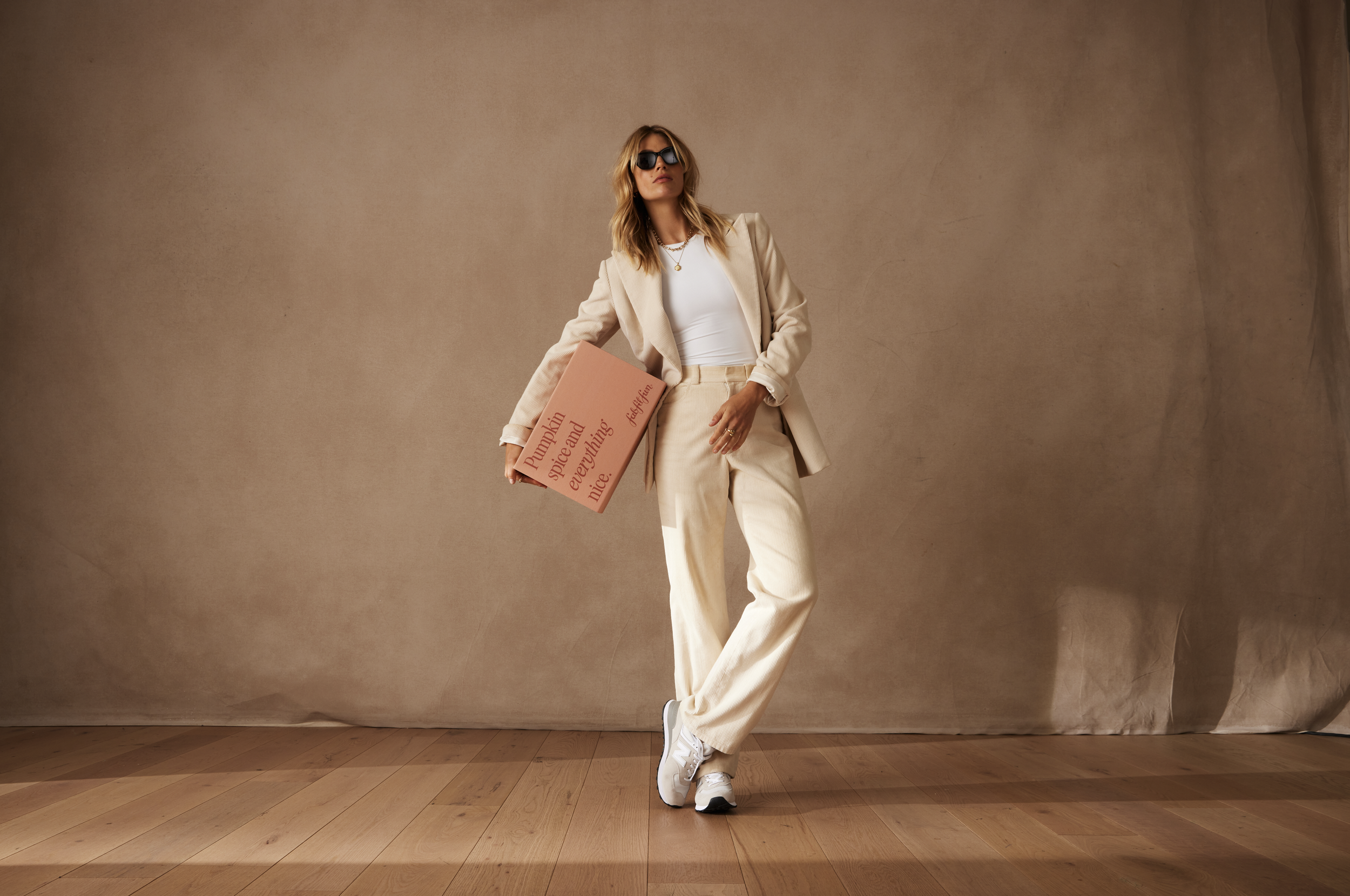
Designed advent calendar box. This is an example where the bounds of the typical ask were pushed - working within the guardrails to keep this non-denominational but still feel special. The advent calendar box design has the capacity to be a bit more visually adventurous. This abstract style achieved a holiday feel without feeling traditionally "Christmassy."
This creative was prior to the re-brand that launched in 2023.
Seasonal box design for winter quarter. The goal was to create a scene that felt like it came from within a snow globe. My concept represented a light hearted scene from a New York winter day.
This creative was prior to the re-brand that launched in 2023.
A collection of Seasonal Summer creative assets. The goal was to version out cohesive assets that would be seasonally on brand and live in different spaces.
This creative was prior to the re-brand that launched in 2023.
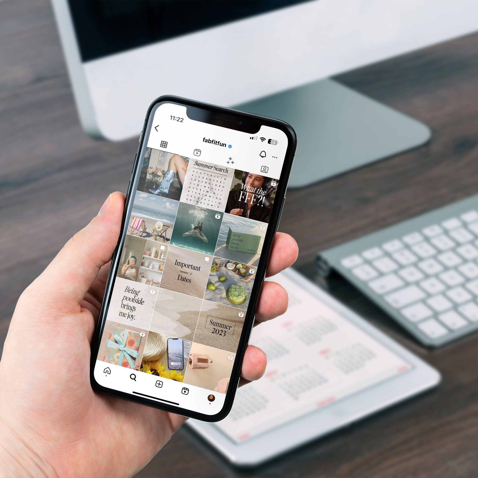
IG Story slides for highlights meant to give a place to the FFF 'About Us' info, therefor making that introduction easier to access to new and existing customers.
This creative was prior to the re-brand that launched in 2023.
Emails I rebuilt from scratch for the CRM team.
This creative was prior to the re-brand that launched in 2023.
Emails I designed for a collab campaign with Paris Hilton. FFF was working on a limited edition box and I created on brand email options to send out to different customer segments.
Some examples of emails I designed for a couple of big sales.
This creative was prior to the re-brand that launched in 2023.
Seasonal social media assets announcing some of the re-fill items available to the customer.
This creative was prior to the re-brand that launched in 2023.
Seasonal social media assets announcing some of the Spoiler Alert products available to the customer.
This creative was prior to the re-brand that launched in 2023.
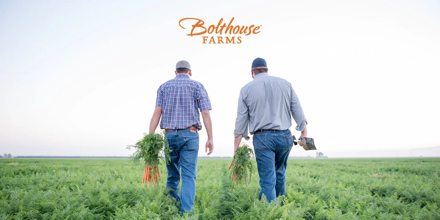
Bolthouse Farms is nation wide CPG company with over 3,000 employees; known for their carrots, beverages and dressings.
While working at Bolthouse Farms, I had the opportunity to work on a variety if projects as an in house designer. It was exciting to work both for our outward facing brand and our internal corporate identity. Some examples of the work I did included: digital assets, packaging design, iconography, logo design, branding & brand management, box designs, apparel + merch design, large format trade show assets, POS, OOH and event marketing materials. I worked on multiple projects from ideation to implementation across different touch points.
Role
In-house Graphic Designer
Key Stakeholders
Leadership, Art Director, Brand Managers, Dir. Marketing & Events
Company
Bolthouse Farms
Years
2018 - 2022
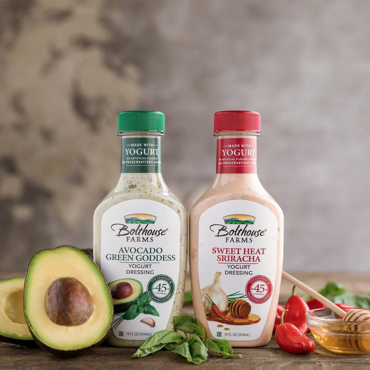
I created the label vignettes for these two new flavor SKUs. The process included: concept iterations, sourcing the images for the key art, nesting the ingredients together, photo editing, updating any relevant information for the new flavors, and prepping for production. The main goal was to make sure the ingredients have flavor appeal and look delicious.
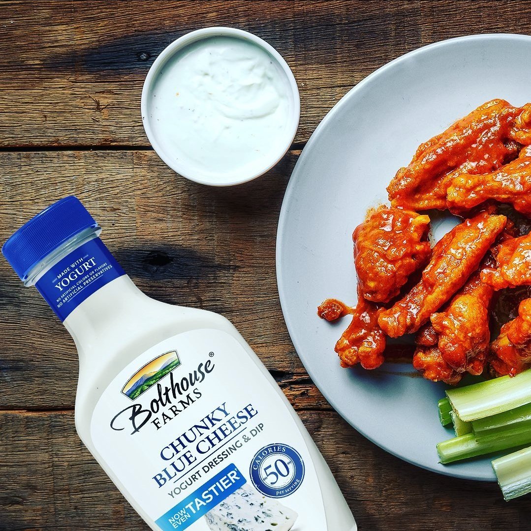
There was a formula change for a few of the popular dressing SKUs and my task was to add new messaging to the primary display panels without making any major adjustment to existing layout. This made things a bit challenging as the label is already a bit crowded. My solution was to create a banner for the copy "Now Even Tastier," paired with a color that tied back to the main SKU color to highlight the new messaging.
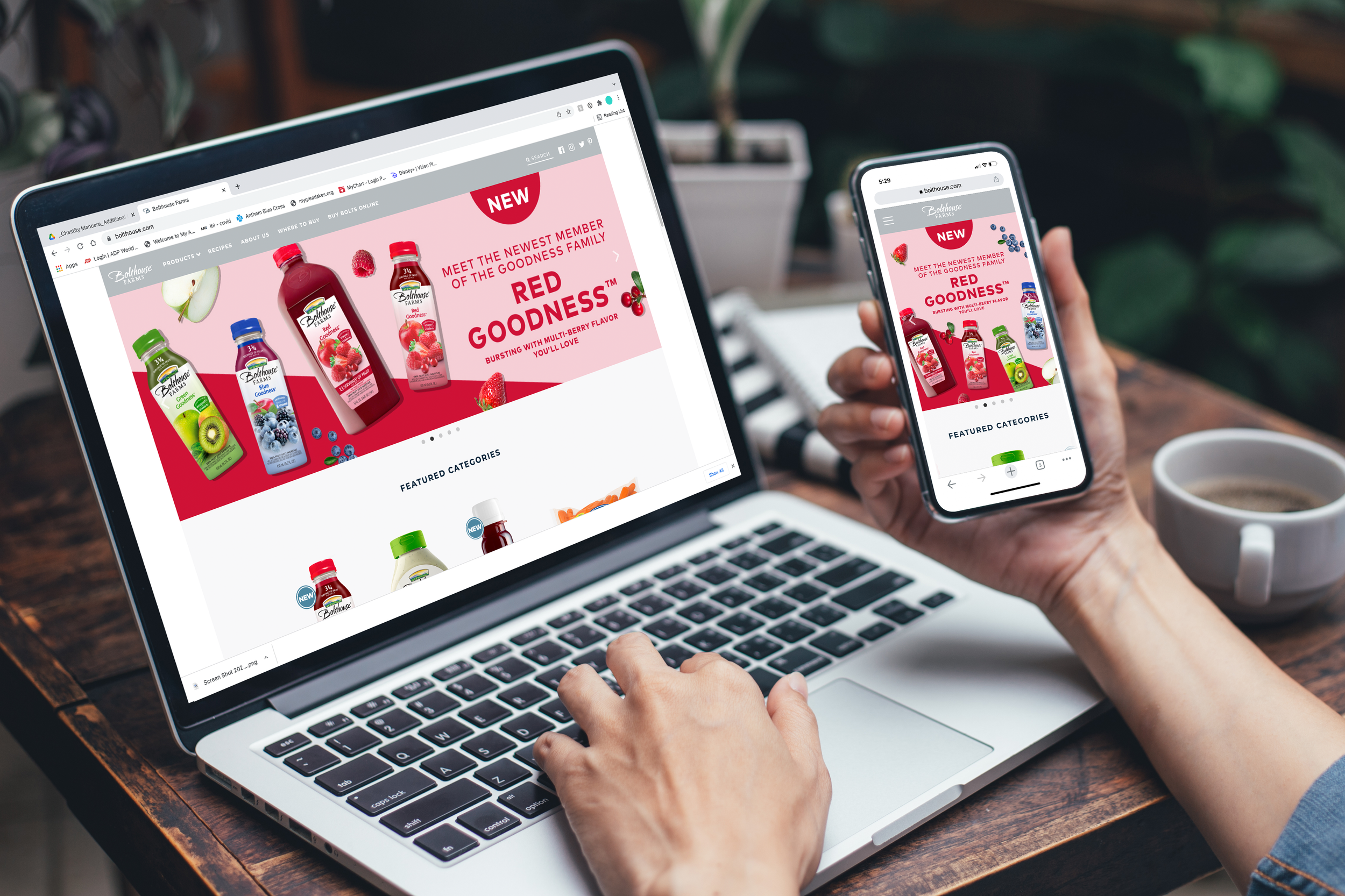
Designer digital banner for desktop + mobile. These banners were created to highlight a new beverage flavor "Red Goodness." The creative had to align with the interim branding BHF was using during a transitional time. I executed with the interim branding in mind, while also maintaining cohesion across the beverage line.
I created to label vignette for this new SKU called Lemon Basil. The main goal was to make sure the ingredients have flavor appeal, look delicious and sit well together. I achieved this by referring to our existing dressing portfolio for cohesion.
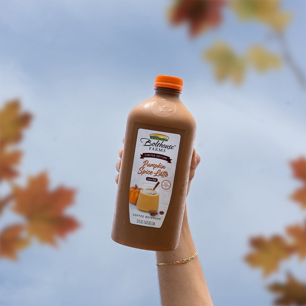
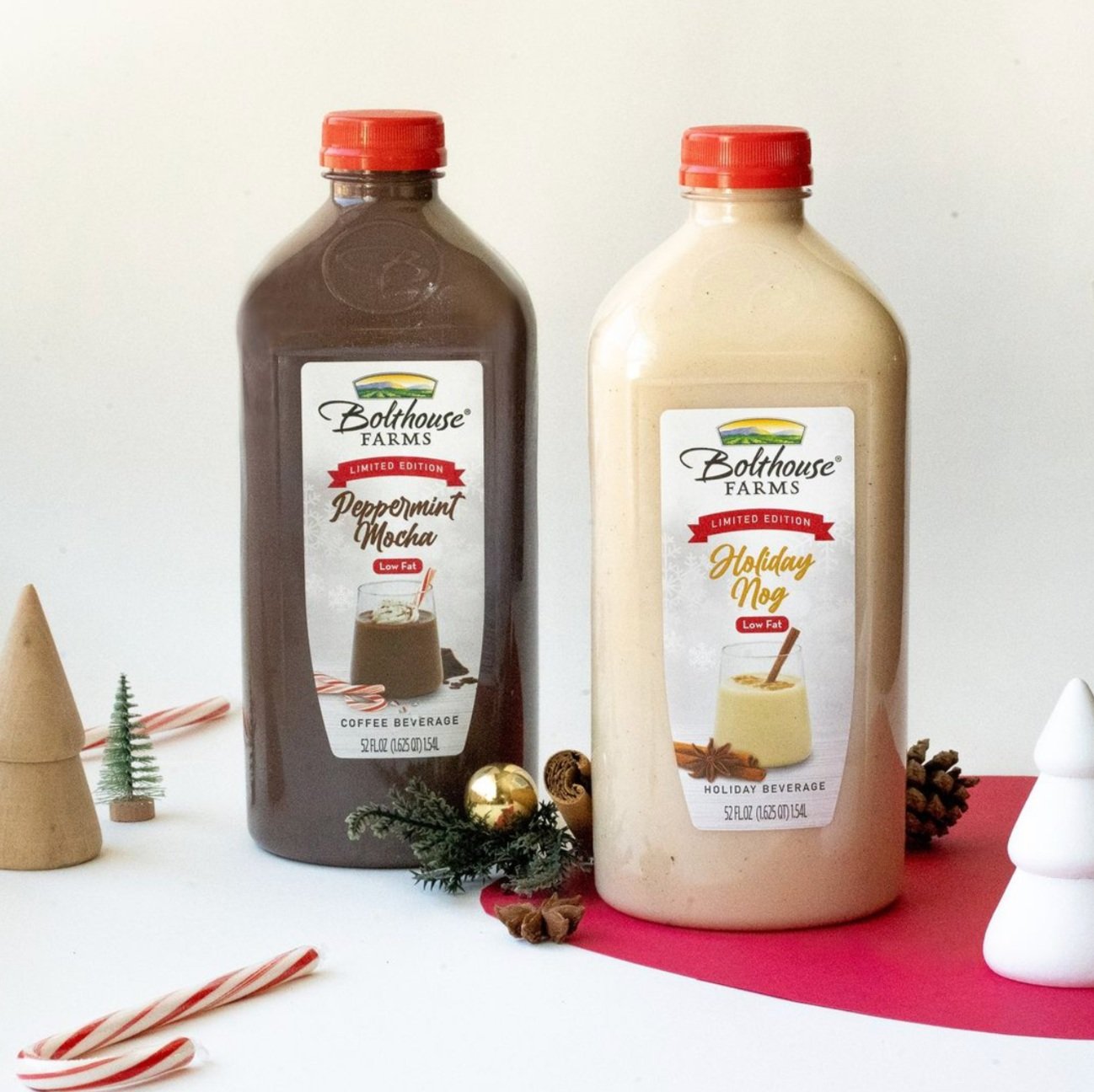
This project was lead by myself, under the guidance of my Sr. designer. I was tasked with updating the look and feel of the holiday SKUs, Holiday Nog, Peppermint Mocha and Pumpkin Spice latte. I needed to maintain the hierarchy of the communication on the label, while bringing a fresh look to these old labels. I created the key art on the label that then directed and went into a photoshoot for the final product.
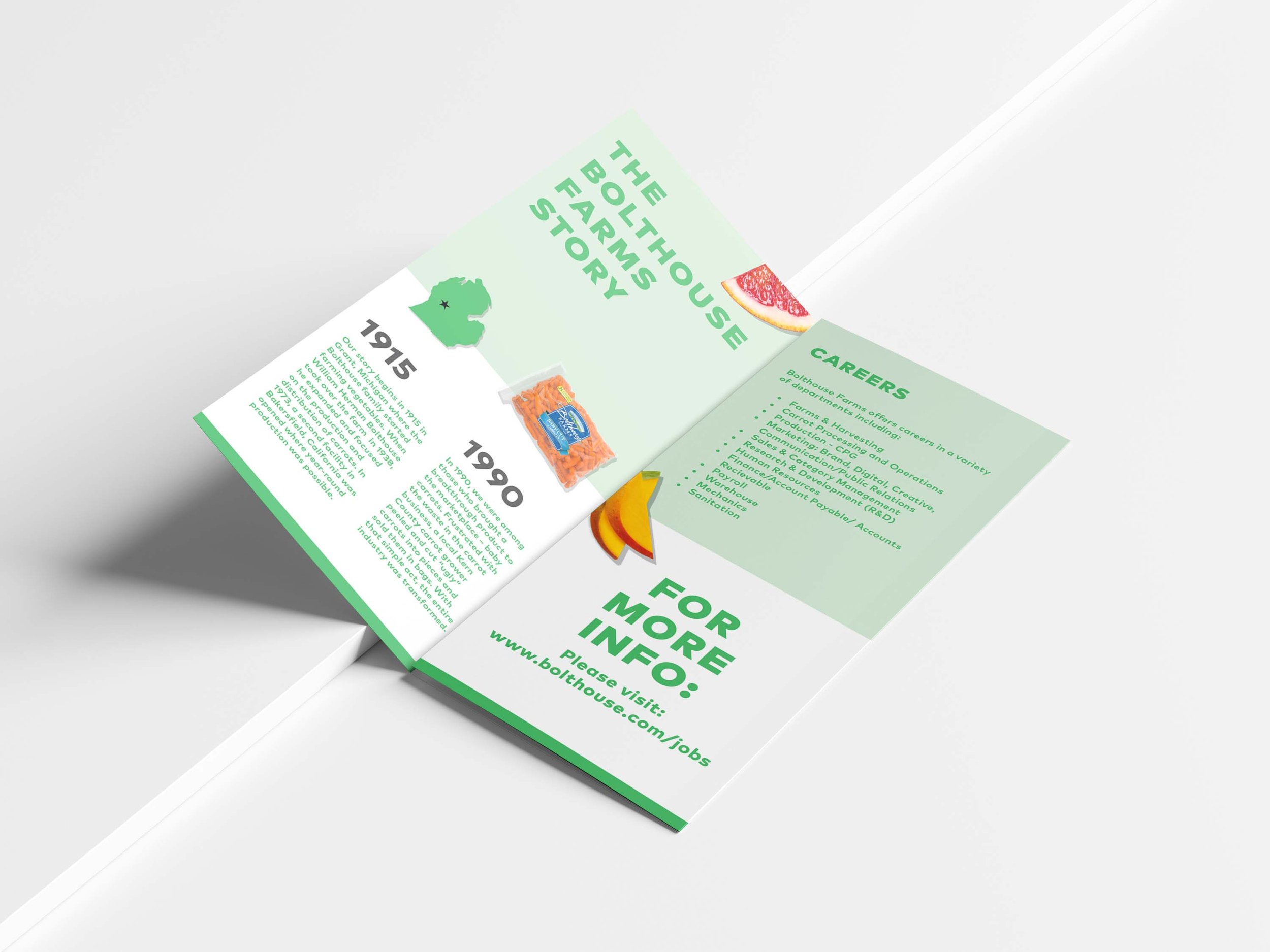
Designed brochure for recruiting purposes. The brochure had information on who Bolthouse Farms was and career information. This creative married the existing interim branding and pushed it out a bit further by bringing in color and ingredient imagery in a new way. The solution was to create something opposite of a boring recruiting brochure. That was achieved by making it exciting at first glance and make the messaging concise and easy to read so as to get folks to engage.
The ask was to create a designed box that would be sent out to influencers with product in it. I decided to use color + typography to draw attention to the box. I designed with a clean but playful aesthetic in mind that would resonate with audience that would be receiving these boxes.
BHF had a collaboration with Ross Mathews who created a salad recipe using our dressing. I worked on designing the hero banners that would highlight the collab as well as POS tags that would live on the product in-store. I designed the assets by pulling in some elements from the "Rossipes" branding and utilizing a BHF color palette + featuring the SKUs used in the recipes. The POS coupon tags served as a means to call attention & drive sales.
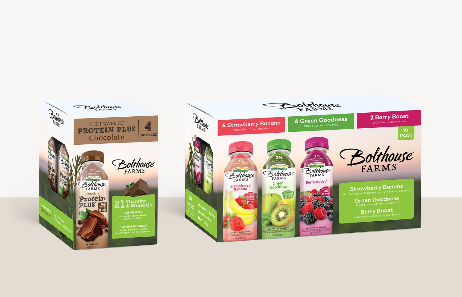
Digital mockup of the designed wrap that would go on the boxes sold in store for this multi-beverage package. Designed with communication hierarchy in mind, I highlighted the flavors in each package and featured the product itself for easy recognition on shelf.
Digital booth design for use in trade shows. This design was created with the interim style guide where I brought in the use the emoji icons and color palette our social media agency at the time had implemented. This style was meant to feel more brighter and more playful.
This digital space is the product of the pandemic. When everything started to shut down, trade shows went virtual. This was a concept I created using the interim branding with a mix of the older look and feel for recognition purposes.
An example of a POS coupon design I created for the Wunderoots brand. This was a new product line and the goal was to give in-store incentive so customers would engage and become familiar with these products.
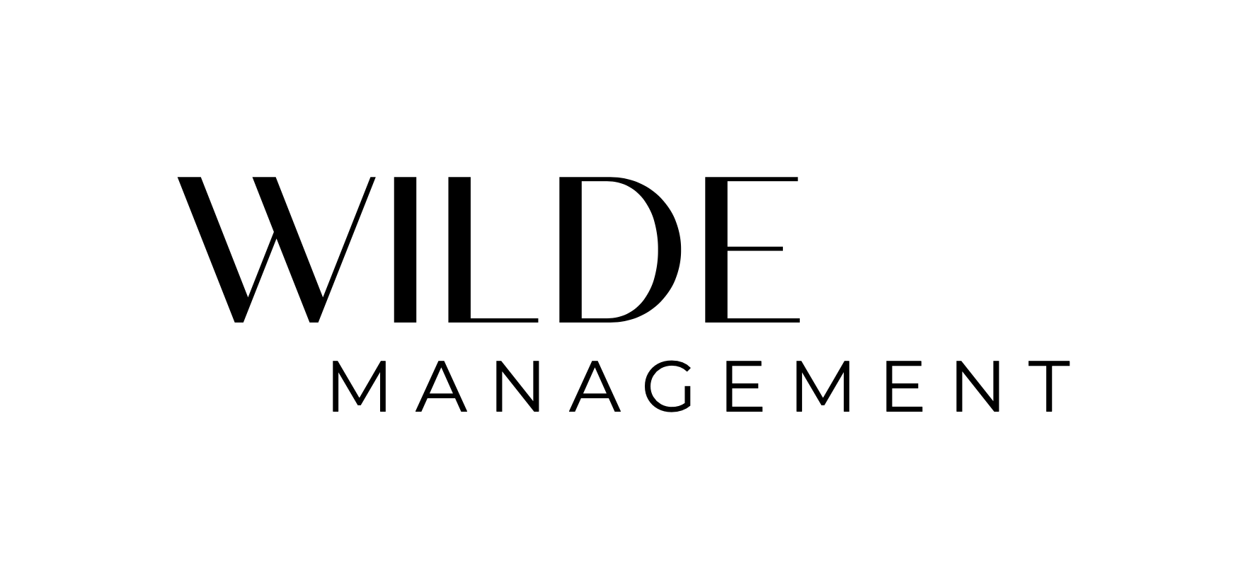
WILDE Management is a full service female owned and led production / artist management agency founded in Los Angeles.
Their vision is breaking industry barriers by promoting a diverse roster of artists and business owners. With a mission to break down industry barriers and a GOAL is to live fearlessly by always venturing into the WILDE.
I worked closely with the founder to create a logo design that would feel strong, stand out and feel professional. I solved for this by selecting a san serif font that reminded me of the Vogue logo a bit. Composed of two weights, it felt elegant, strong and classic.
Role
Graphic Designer
Key Stakeholders
Founder
Company
Wilde Management
Year
2022
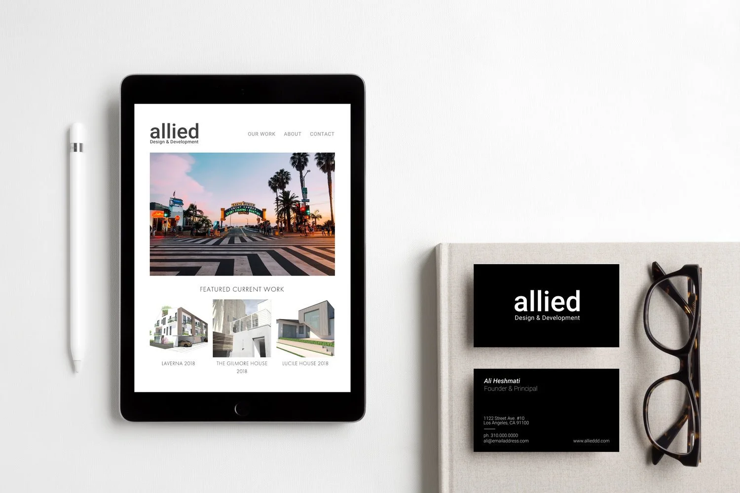
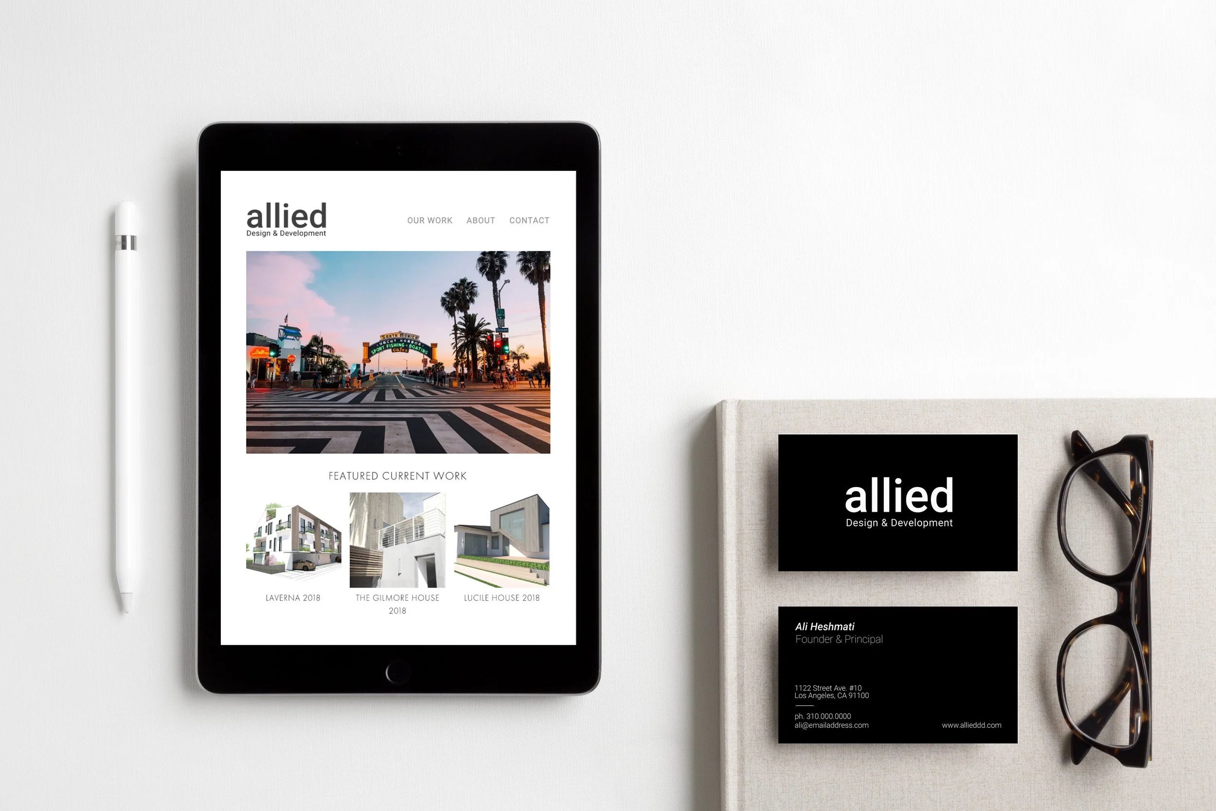
Allied Is a full service Architecture, Design & Real Estate Development company based in Los Angeles. Founded by Ali Heshmati in 2016. Our leadership team has a portfolio of work, that combined, spans over three decades and across different building typologies. Our services cover everything from Master Planning, Conceptual Design and Construction Documentation to Entitlement, Permitting and Construction Administration.
They are a group of Architects from different backgrounds whose main mission is to ensure we create high quality experience through our work, and ultimately leave behind a built environment we can all be proud of.
I worked closely with the Founder, to freshen up and further develop their brand. I created a style guide that gave us a better idea of how they wanted the Allied brand to feel; which was clean, minimal but welcoming and friendly. I cleaned up the word mark and re-skinned their website as well.
Role
Graphic Designer
Key Stakeholders
Founder
Company
Allied Design + Development
Year
2021
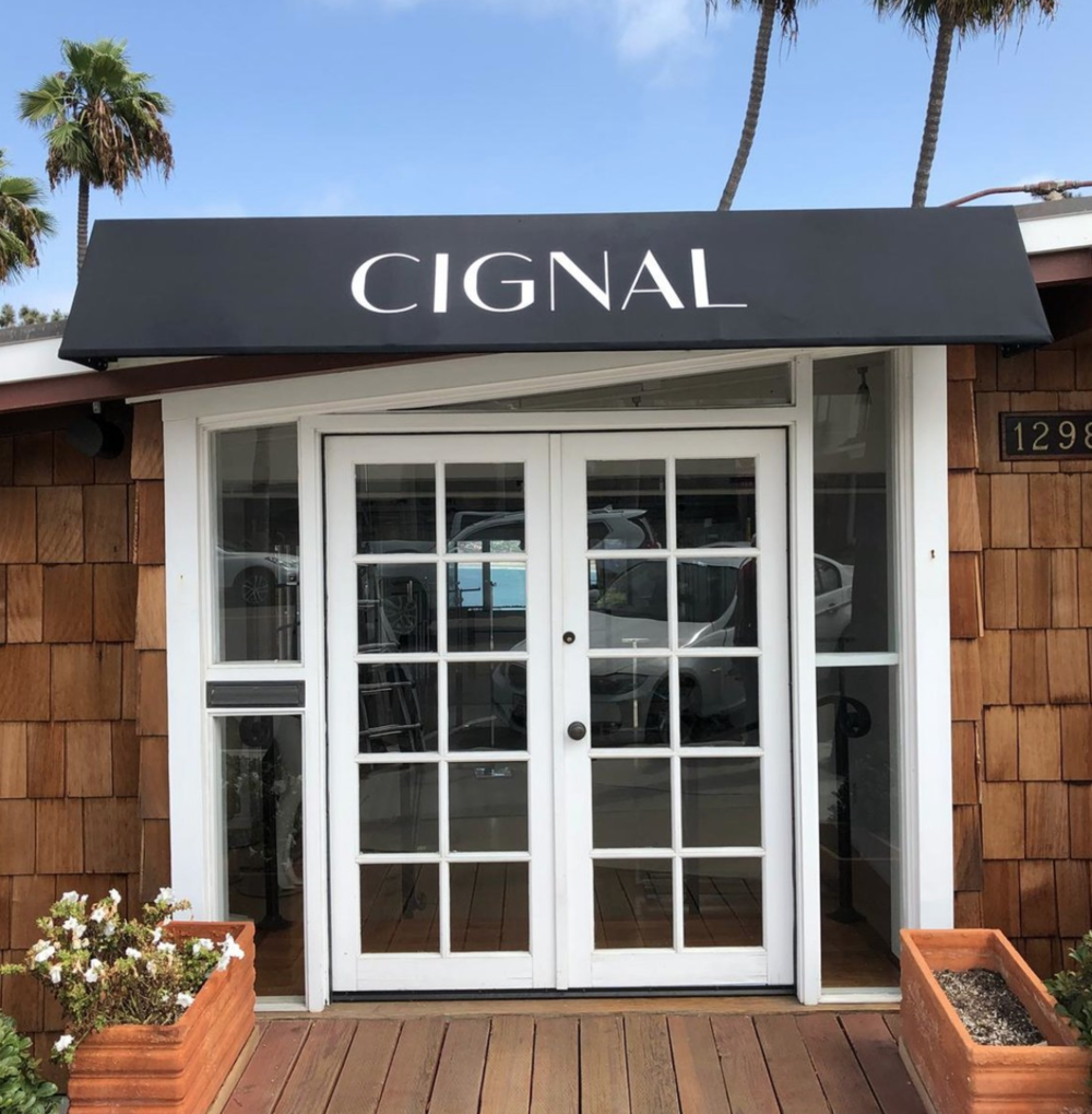
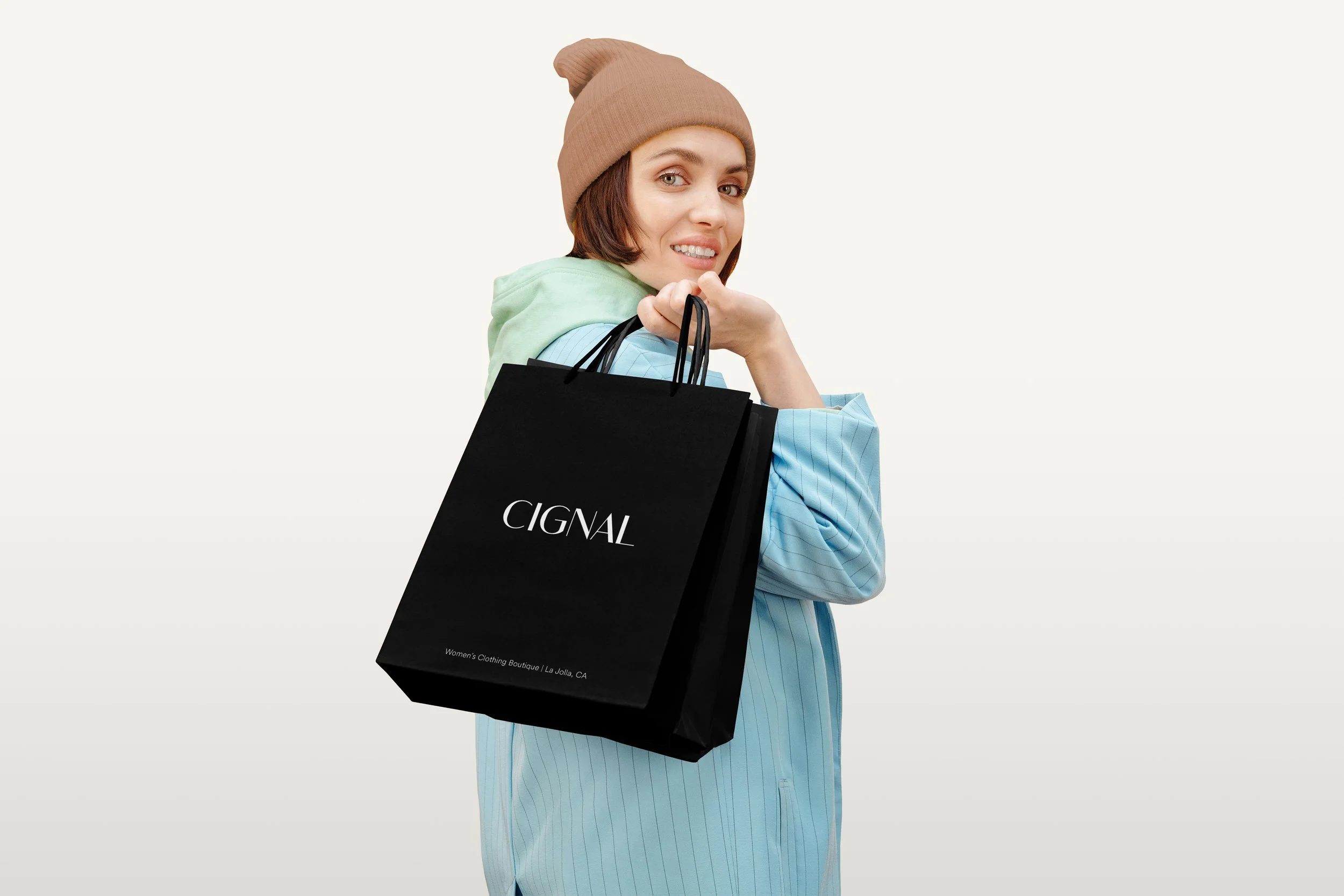
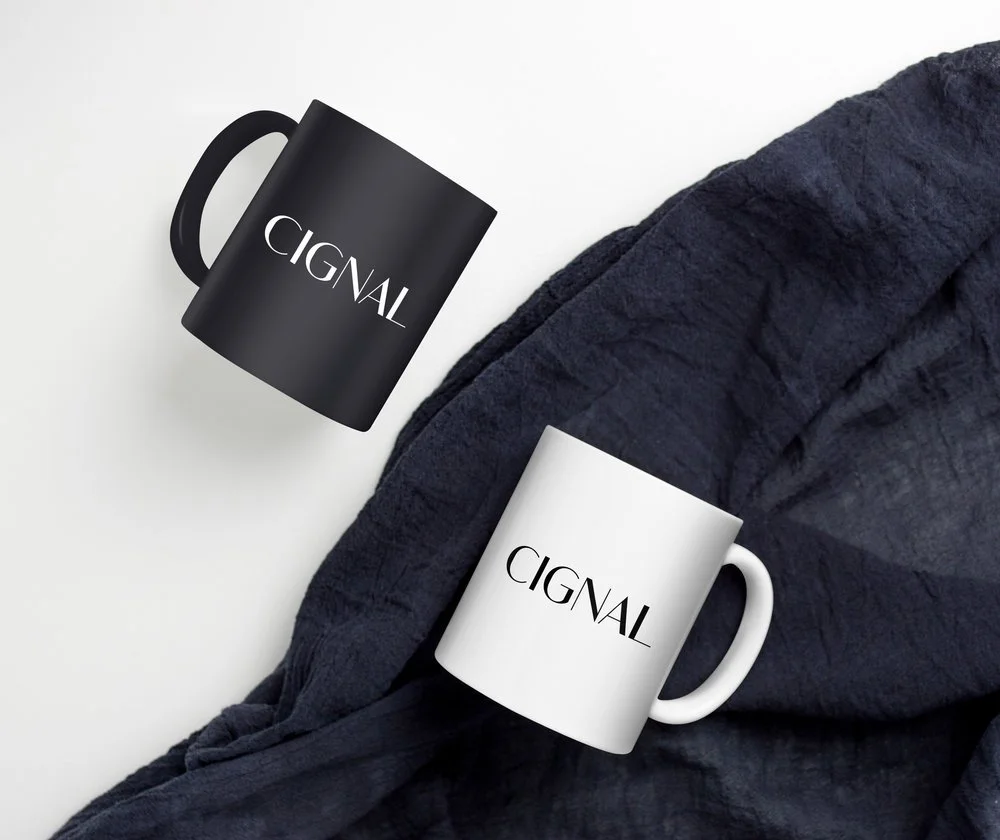
Cignal is a female owned, women’s clothing boutique.
I worked closely with the owner to refresh the logo. With the updated logo, I created the business sign for the storefront. Additionally I created to mockups to show her how the logo could work in application.
Role
Graphic Designer
Key Stakeholders
Owner
Company
Cignal Boutique
Year
2019
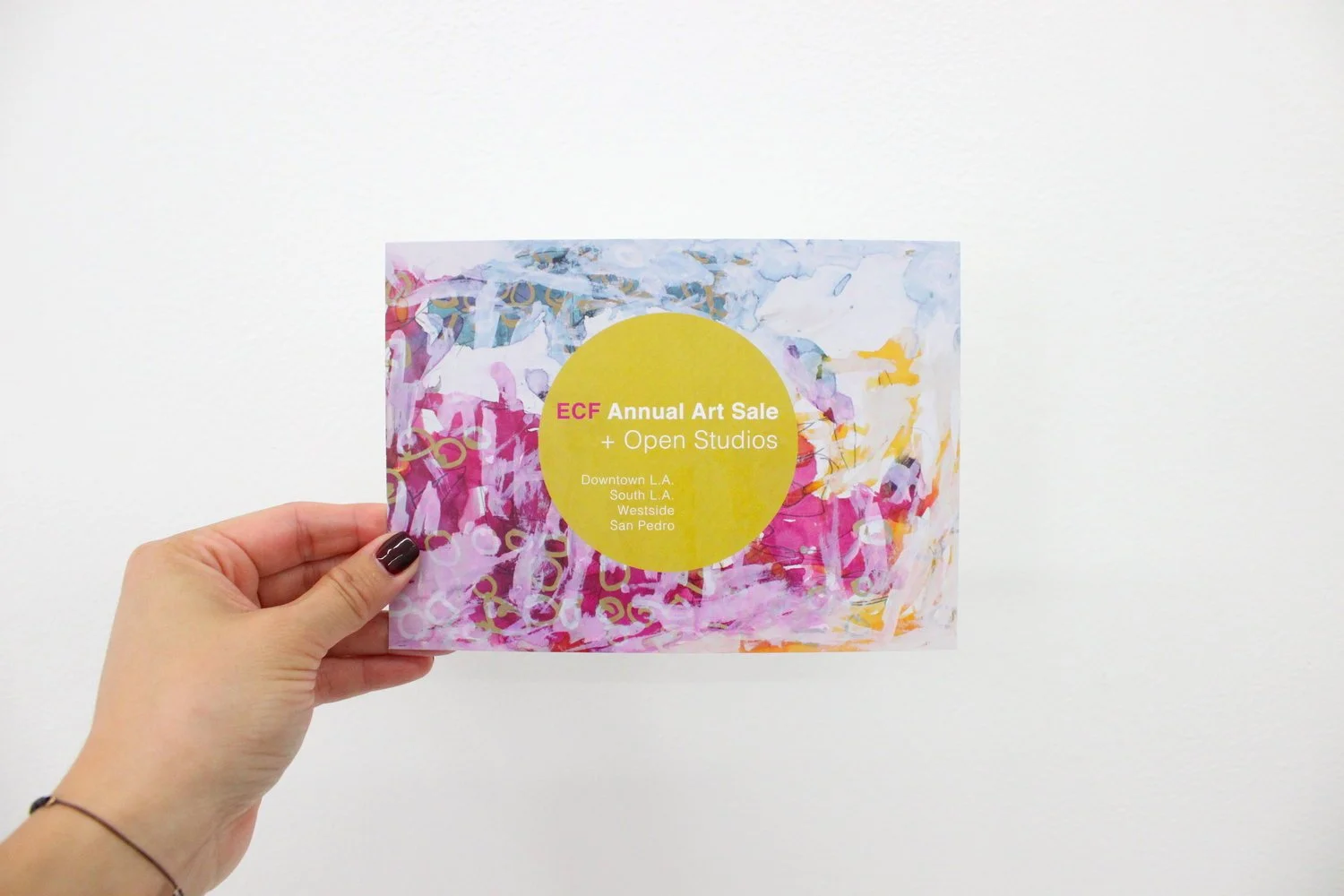
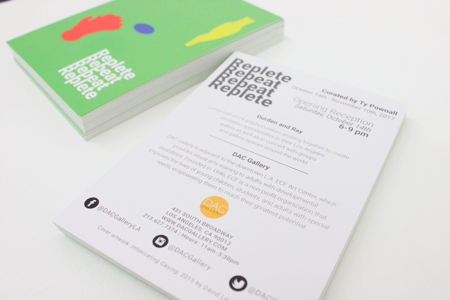
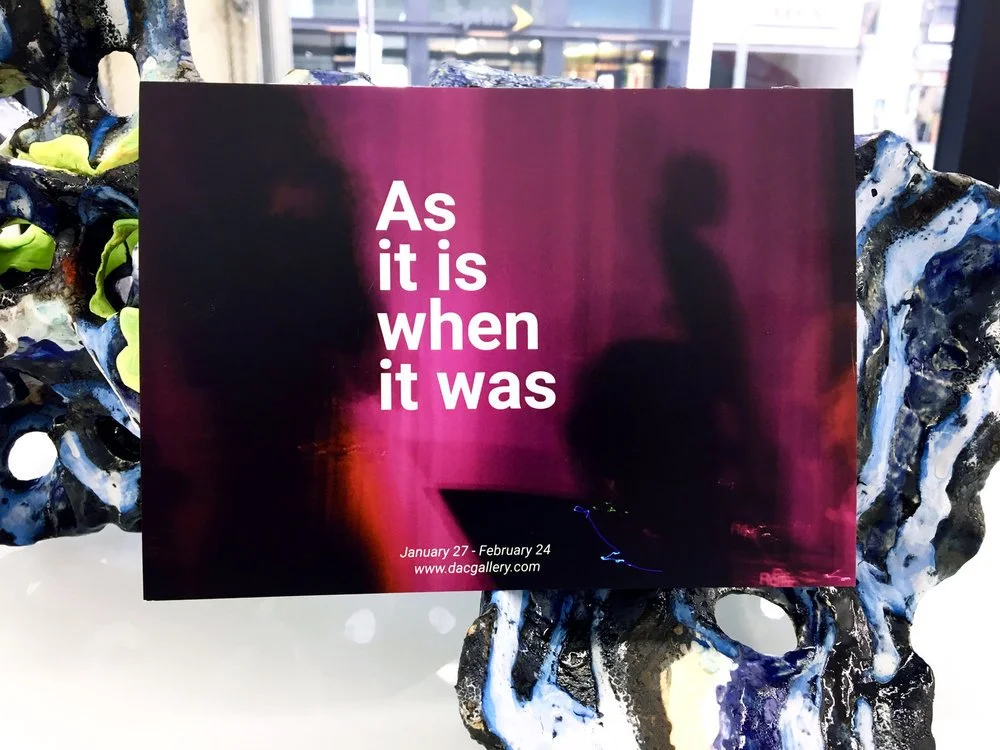
At DAC Gallery (Downtown Art Center) I held a couple of creative roles. I started out as a substitute art instructor, working with adults that have developmental disabilities and quickly moved into the gallery coordinator role + In house graphic designer for the monthly art shows. I created the promotional material for the shows that was shared out with our prospective attendees. These are some examples of promotional post cards I created for some of the exhibitions. I also have a couple examples of photographs I took of the artwork we would use for different touch points.
Roles
Gallery Coordinator, In-House Graphic Designer, Sub. Art Instructor,
Key Stakeholders
Gallery Director
Company
DAC Gallery (Exceptional Children's Foundation)
Years
2017 - 2018
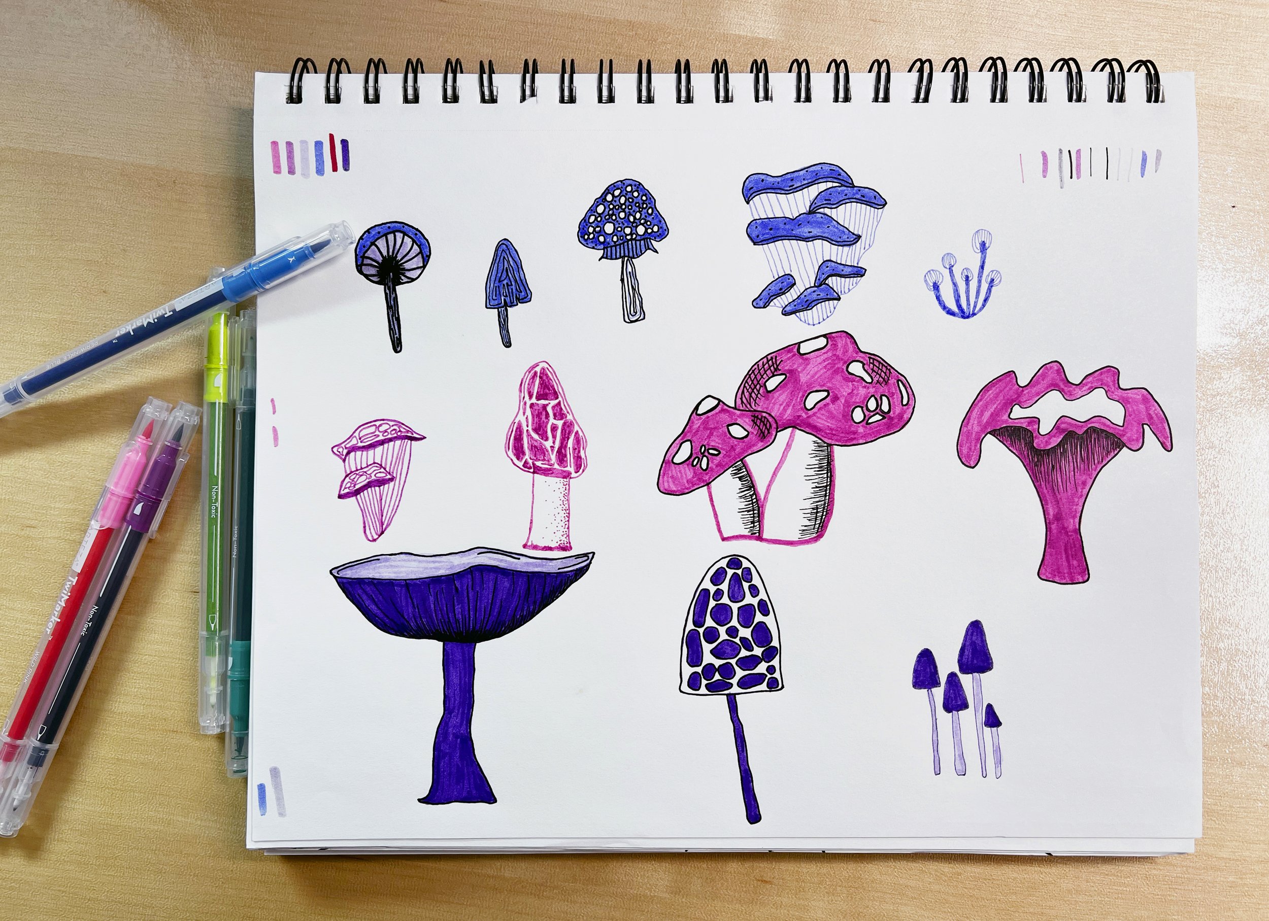
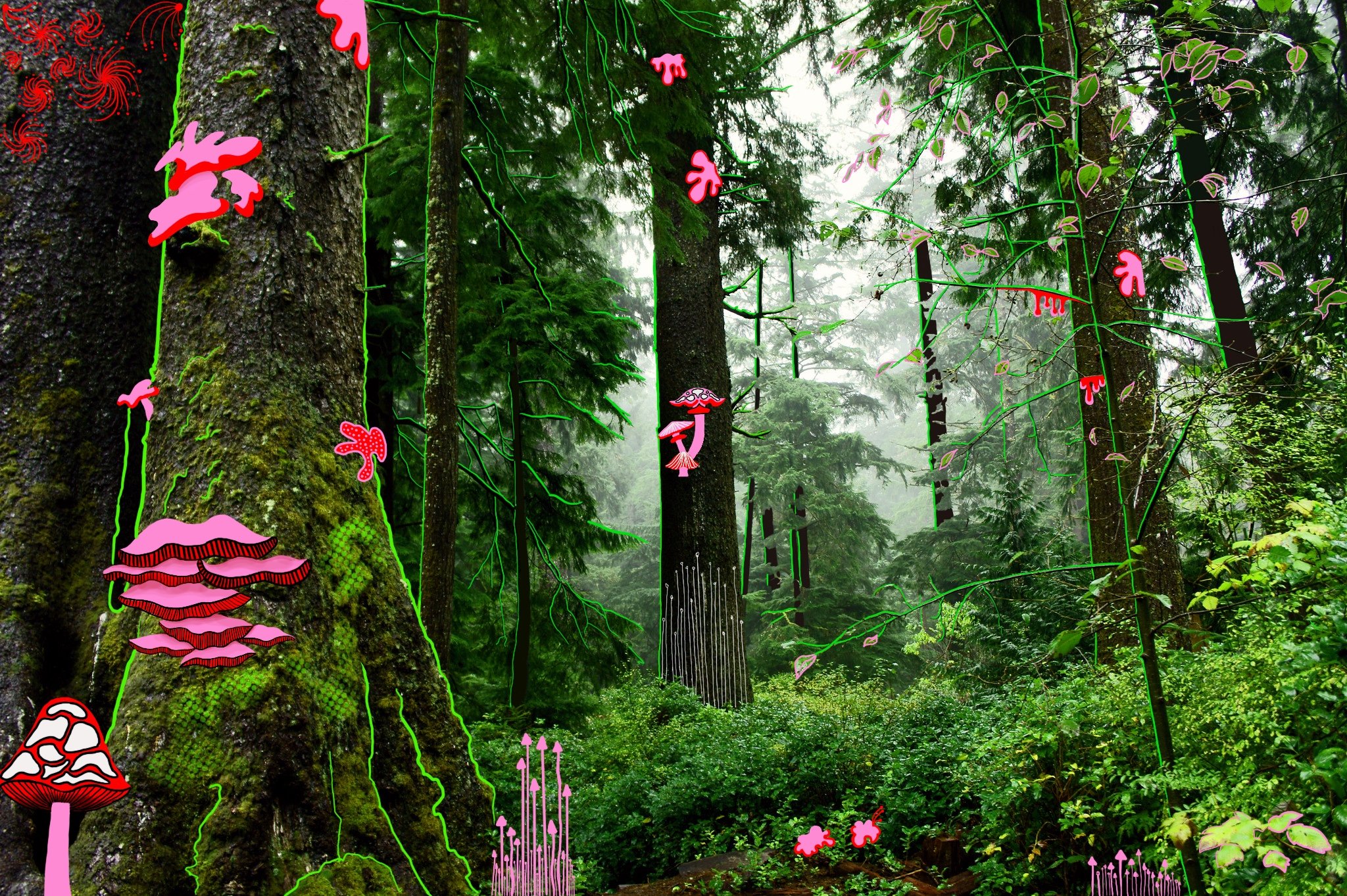
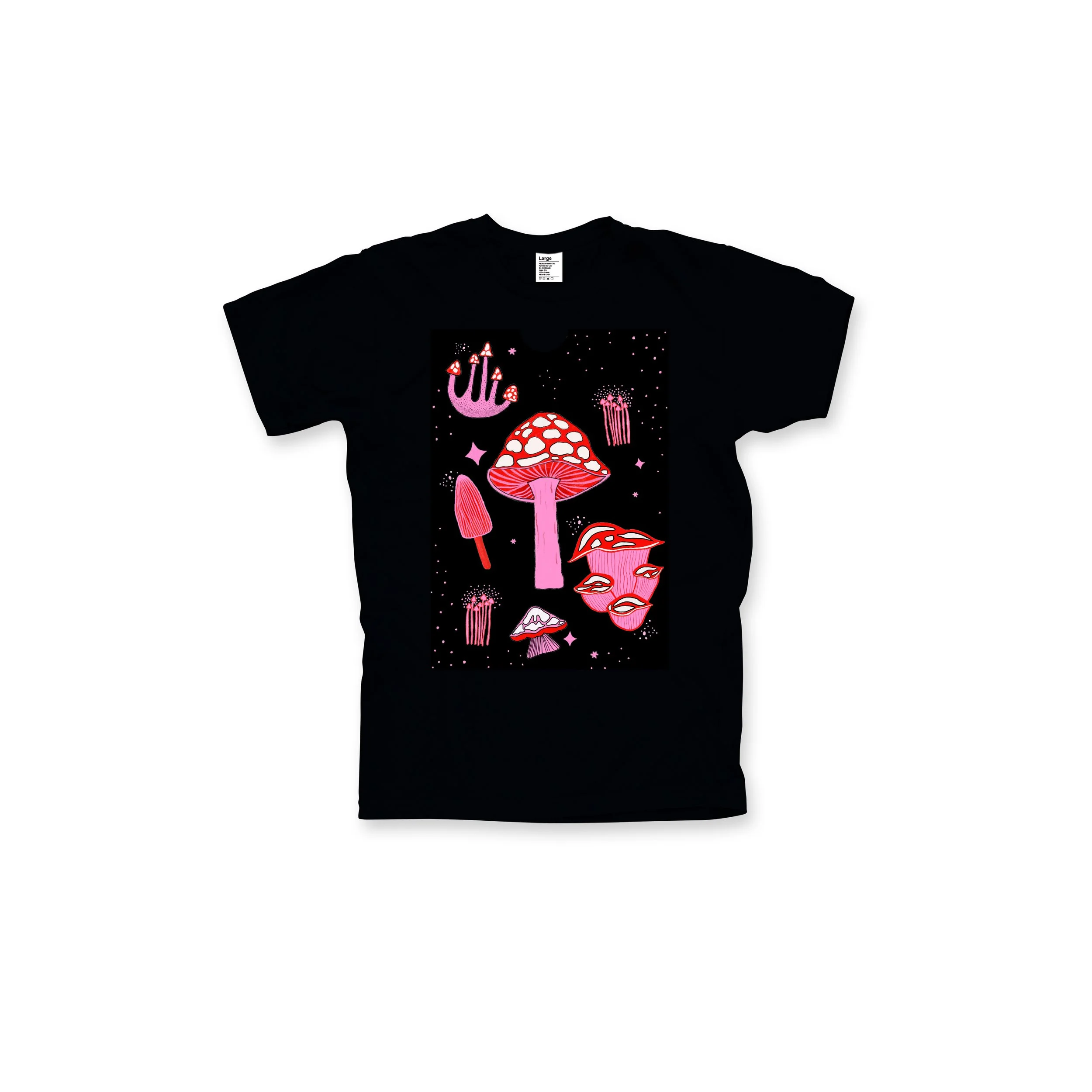
My field of study in college was Studio Art with an emphasis in Graphic Design. Through this, I have had the opportunity to draw and paint with different mediums.
Over the years, I’ve also done a bit of digital illustrations here and there but in the last year I have really taken to drawing digital illustrations (via Procreate). I have really enjoyed being more playful with this form of art. I have been trying out different styles, and having fun while doing it. I plan to share more of my work here as I continue working on personal projects, both digital and pieces from my sketchbook.